So pretty! But how do I use it?
Redesigning gulliver 👇

CHAPTER ONE

Overview

Redesigning Gulliver

The Group Travel Discovery & Planning Experience - So pretty! But how do I use it?
Project Overview
Gulliver is a travel app that focuses on visual discovery for group travel, making discovery and information collation for travels seamless and intuitive. The startup was struggling with their product design. Their existing prototype was pretty but unfortunately confusing to use, making the user experience much to be desired. Thus, this started my stint to redesign gulliver.
My Role | Head of Product
My main responsibilities included spearheading product and branding direction, strategically balancing business and development needs in the product’s life cycle, leading a product design team and single-handedly introducing and implementing design thinking processes to the early stage startup.
Clients
Gulliver (Travel startup)
Outcome
Working app alpha launched for small scale testing, official launch in fall 2020
Timeline
May 2020 - Jul 2020
Design Tools
Figma, Maze
Platform
Mobile, iOS
Strategy & Skills
Heuristic review, Secondary Research, Competitor Analysis, Personas, User Journey Mapping, Requirements scoping, Sitemap, Rapid prototyping, Usability testing

Gulliver 2.0

CHAPTER TWO

Understand

A shift is needed

Research Method

Heuristic Review, Competitive Analysis

Rationale

The initial prototype, gulliver 1.0, was aesthetically pleasing. However, it was confusing and the user experience could be greatly improved. Hence, I conducted a heuristic review to pinpoint which parts of the design needed work and redesign. Thereafter, I conducted an in depth competitive analysis to better understand the industry gulliver is in and how we want to stand out.

Gulliver 1.0 Heuristic Review


What is a Heuristic Review?

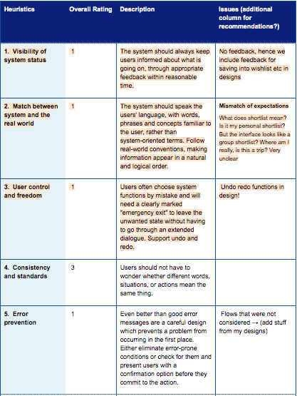
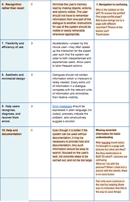
Using Nielsen Norman's 10 usability heuristics for interaction design, evaluators give a severity rating for each heuristic and leave remarks if any for specific parts of the prototype.

How was it conducted?

3 evaluators go through the entire flow of the prototype twice. The first time was to get a feel of the flow, interaction and general scope, like a first impressions. The second was to go deeper and focus on specific elements while knowing how they fit into the larger picture.

I will be highlighting the top 3 heuristics that needed to be addressed.

1. Navigation is confusing

Heuristic: Recognition rather than recall

Questions evaluators had:

  • Why is the sidebar on the left? To access the profile? Not clear nor intuitive.
  • So is the first page the profile page? Seems like a very strange experience, everytime I'm in the app I see the profile page first?
  • The add button brings me to a page with different countries? But why? Also, what are the photos at the bottom of the big picture in the middle?

2. Missing essential information for basic understanding

Heuristic: Help and documentation

Questions evaluators had:

  • After inputting travel dates, I’m brought to a page with pictures - but what are they? Are they destinations in Bali? Or what? - The pictures are confusing. There aren't any words to tell me anything.
  • What do I do with the pictures? When I click into a picture with the details, there is no save button. Am I supposed to simply view the pictures with the relevant details and that's it?
  • Oh so I can only save a picture at the start by swiping? But there was no indication that this is the way to save things? This is a novel interaction that I would never have known.

3. Mismatch of expectations

Heuristic: Match between system and the real world

Questions evaluators had:

  • What does shortlist mean?
  • Is it my personal shortlist?
  • But the interface looks like a group shortlist?
  • Also, I'm not really sure which part of the app I am... is this a trip? Very unclear.

Competitive Analysis


Rationale

I did a competitive analysis to better understand the tourism market and best position gulliver to fill that niche gap. An in depth analysis was done on 20 direct and indirect competitors with a focus on product features (not forgetting rationales for those features), user flows, and branding (to position our brand as well).

Insights found

For novel interactions, short intro tutorials will be goodcategories up there, easy navigationSIGN UP vs. GUEST behavior- native app —> sign up (FB/ Google over manual sign ups)- web —> guests allowed, explore first then push for sign up

CHAPTER THREE

Unpack

Analysis Method: Personas


Rationale

Gulliver 1.0 was not designed with a person in mind which was problematic. Features were just added in without really accessing whether they were really necessary in addressing the users' problems. Hence, for me to redesign gulliver 2.0, I developed 2 personas - the active trip planner, and the casual browser - from secondary research and existing data we had from our users. Knowing who you are designing for is especially important to keeping your designs focused, simple and intentional.

Why 2 different personas? Especially being in the midst of the Covid-19 pandemic, active trip planning may be less frequent for now. Hence, it was important to segment the 2 behaviors - getting inspired on where to go next vs. actually planning a trip with a group actively.

Analysis Method: User Journey Mapping


The Active Trip Planner

  • Individually discover easily
  • Getting different requirements from group
  • Agreeing as a group
  • Exporting for travel

Analysis Method: User Journey Mapping


The Casual Browser

  • Have inspiration all in one place, reduce cross referencing
  • Reduce cognitive load to aid decision making
  • Easily share inspiration board with travel buddies

Requirements Scoping

Key Tasks & Design Objectives

1. Reduce cognitive load by being Visual-first (filters can come in later)


Targeting: Information overload, overwhelming number of choices, little time

2. Transparent adding and voting system to facilitate efficient communication

Targeting: Frustrating to keep track of group requirements and agreements

3. Automation of easy export in the form of pdf, excel, Google Maps


Targeting: Manual exporting to maps/ excel is time consuming

CHAPTER FOUR

Unify

Finalizing Features


Step 1

Led an affinity mapping ideation workshop over zoom. As we were dealing with 3 different stakeholders (end-users/travellers, photographers, brands), we listed them out and problems they each face and features that target each problem.

Finalizing Features


Step 2

From our initial feature brainstorm, we used points to rank yes vs. no. Next, we did a long-term vs. short-term analysis on the “yes features”.

Finalizing Features


Step 3

Finally, we broke down the “short-term features” into sub-features and deep-dived into the requirements of each feature.

Wireframing


Setting the navigation and flow

Key design change: Using a bottom bar navigation to segment actions more clearly. "Explore" as the homepage and "Trips" as a whole separate action.

Rationale: To keep things simple, I decided to separate these 2 distinct actions from each other (which was previously all lumped into one which contributed to confusing users). Now, under "Explore", users can discover and get inspired, while "Trips" should only be utilised when they have a trip they are actively planning for.

Sitemap

Similarly in the sitemap drawn up, you can see that under "Explore", the primary actions are non-trip centric while "My Trips" consists of actions that are trip centric.


CHAPTER FIVE

Update

After wireframing, I went into designing a mid-fidelity prototype that I will call gulliver 1.5. (Recap, gulliver 1.0 was the prototype I was brought in to improve on) After some quick and dirty user feedback on gulliver 1.5, I designed gulliver 2.0 according to the insights gathered. In this section, I will be bringing you through 6 key design changes that was made from gulliver 1.0 to gulliver 1.5 and finally gulliver 2.0.

1. Swipe right feedback

Heuristic(s): Visibility of system status, Help and documentation

Gulliver 1.0

Remember previously during the heuristic evaluation, there were much confusion as to what swiping "like" on a photo means?

Gulliver 1.5

The "save" icon has a clearer feedback of what the action does.

Gulliver 2.0

For first time users, information to swipe right to save is shown so as to ease users into this novel interaction. There is also feedback and affordance in terms of the gradient and words used.

2. Undo interactions

Heuristic(s): User control & freedom

Gulliver 1.0

Users can only change their vote at the end in “shortlist”.

Gulliver 2.0

On top of instant undo and changing of votes at the end, users can also unsave instantly.

3. What are the photos?

Heuristic(s): Match between system and the real world

Gulliver 1.0

Remember previously during the heuristic evaluation, there were much confusion as to what the photos are?

Gulliver 1.5

Tried to design according to business objective whereby we took into account other stakeholders. Hence, the design separated into purely photos (left-most) and place cards with details.

However, this design change was also confusing.

Gulliver 2.0

I decided to simplify it into just place cards with details (compromising on this business objective for now and focusing on the user experience), showing not just the photo but the name and location as well to make things clearer.

4. Navigation

Heuristic(s): Recognition rather than recall

Gulliver 1.0

Remember previously during the heuristic evaluation, there were much confusion regarding the navigation?

Gulliver 1.5

Hence, during the wireframing process, there was a major design change on the navigation into separating two key behaviors: 1) Exploring in general and 2) specifically for a trip. This was implemented into gulliver 1.5 as seen on the left.

Gulliver 2.0

There was some confusion in terms of interaction. To save place cards simply for inspiration, users swipe. To add place cards into group trips for your group to vote, users swipe.

Swiping is a rather casual interaction. When adding place cards for group voting, the commitment is much bigger than swiping simply for inspiration. Hence, I changed the interaction into an add button where users can easily remove (instantaneous feedback). Also to make it clearer and reduce recall, items that were previously saved or swiped will appear at the top which users can add for group voting as well.

5. Voting as a group

Heuristic(s): Match between system and the real world

Gulliver 1.0

Remember previously during the heuristic evaluation, there were much confusion as to what "shortlist" meant? Was it an individual or group shortlist? One can only guess it is your own shortlist which means you couldn't see votes of other people in the group, which defeats the purpose of group voting.

Gulliver 1.5

The group voting page is much clearer, showing votes and comments of group members as well as yours.

Gulliver 2.0

To reduce influence on decision making, the ability to see others' votes would be in the group page instead of the individual voting page.

Using color coding as a design was also limitative when having big groups, hence, I displayed the total number of votes in this design.

6. Novel voting interaction

Heuristic(s): Help and documentation

Gulliver 1.5

New novel individual voting interaction that was included that was separate from the group selections.

Gulliver 2.0

To account for this novel interaction, a tutorial brought users through how to vote and there were fail-safe buttons as well if users forget so that they don’t need to rely on recall.

Remote Usability Testing

Who & When

  • 6 individuals
  • 1 week

Format

  • Moderated remote video test
  • Task-based scenario

Structure

  • Pre-test: context questions
  • Test-tasks
  • Post-test: debrief, system usability score (SUS) + Net Promoter Score (NPS), qualitative feedback

Goals

  1. Novel swiping interaction: saving inspiration, voting
  2. Navigation
To learn more about the usability of gulliver 2.0, I led my team to carry out usability testing remotely. (because well, the pandemic)

Insights & Next Steps

Insight 1

Quite intuitive once you get used to the flow, would learn to use this very quickly

Things to note: initial friction may be hard as people are impatient
Because of higher unfamiliarity, a good tutorial experience is very important!

Insight 2

May have to develop natively as some functionalities are not familiar to android users as our current design was an iOS one

Next Steps

Led the team to change certain elements to ensure design consistency throughout, fix certain jarring design decisions that was brought to attention during the usability test

As they say, the finish line is a construct. Always be iterating and improving!

CHAPTER SIX

Outcomes

Testimonials

<waiting for testimonial>

Viv's Reflections & Ramblings

In a perfect world...

The development team was relying on me to guide them as to what to build, time was of the essence as I had to work efficiently to keep things on schedule. If I had more time and resources, I would have carried out user-testing earlier to convince stakeholders more easily and streamlining the process.

What I've learn...

This was my first time managing a design team and it was a fun challenge. I also enjoyed communicating and strategizing between different organizational needs from the CTO and CEO. I've also learnt to accept that a design will never be finished because there is always room for improvement. One last note, it was definitely very different to work, design, and user test remotely and it was a good opportunity to hone my skills as virtual becomes the norm.