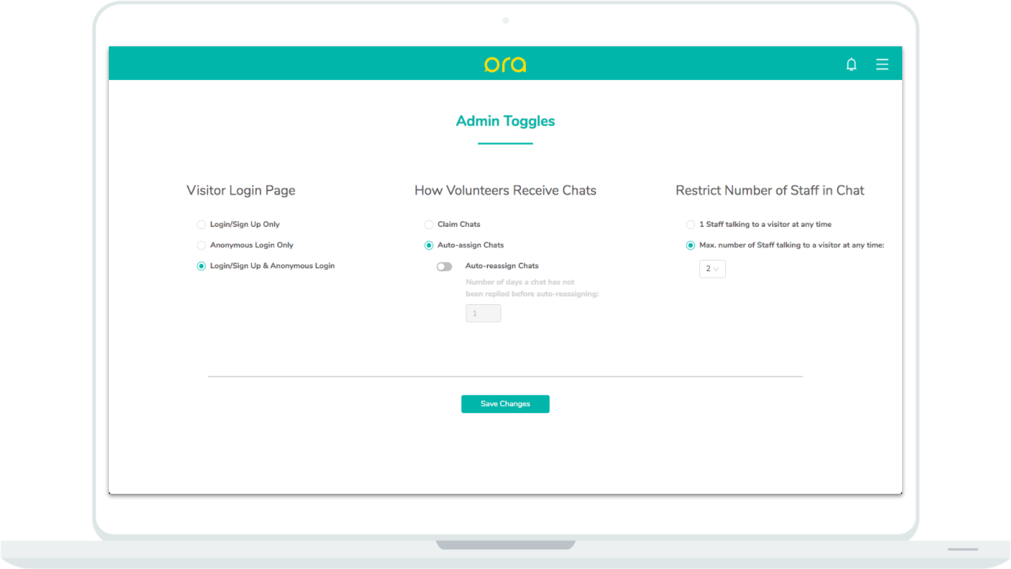
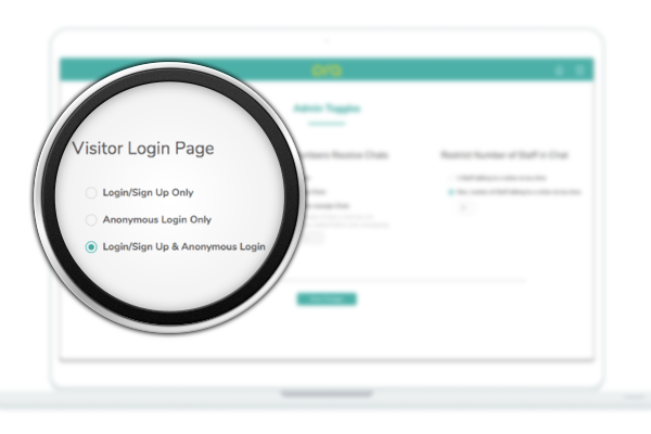
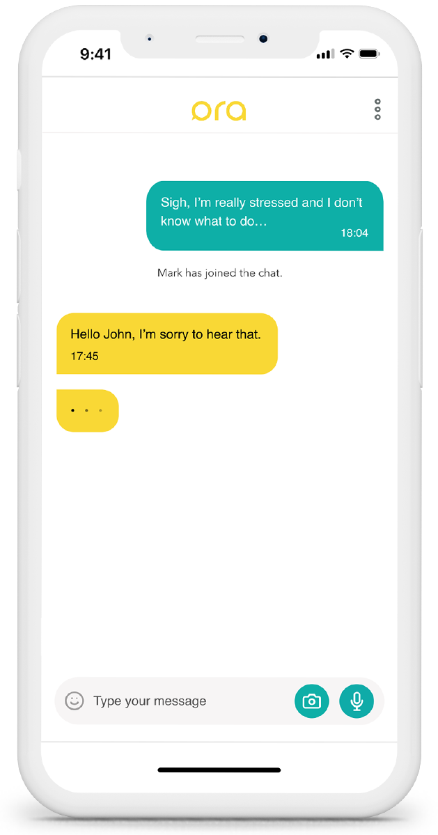
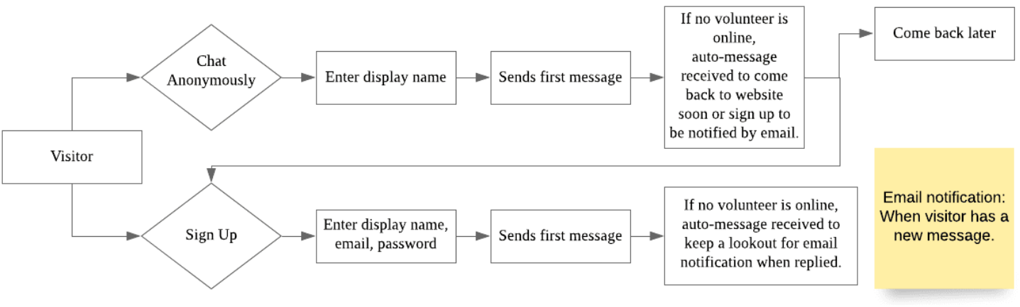
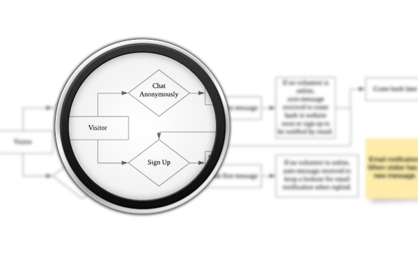
Need a listening ear?
Ora is here 👇

CHAPTER ONE

Overview

Ora

Your Online Emotional Support Chat Platform
Project Overview
Ora is a comprehensive chat suite that provides mental health support by connecting students who are waiting for professional help to verified volunteers who strive to lend a listening ear and provide temporary online emotional support. Ora’s mission is to support and empower our community to tide through tough times of emotional need together.
My Role | Product & Team Lead
My responsibilities were determining the overall product, demo pitches, client communication, marketing and spearheading the design, whereby I single-handedly designed the entire Ora chat suite. To push out features in a timely manner, I worked closely with my team of 4 other developers and managed their workflow.
Clients
National University of Singapore (NUS) Student Support Services (S3): S3 is a program where trained "Peer Student Supporters" volunteer to provide peer-to-peer mental health to NUS students, supervised by S3 staff.
‍Crisis Instant Messenger Ltd: Charity that aims to provide mental health support
Outcome
Designed to customize for different organisational needs to maximize social impact, our demo-ready product was passed to clients to make mental health support digitally accessible in their respective areas of reach.
Timeline
Oct 2019 - Nov 2019
Design Tools
Adobe XD
Platform
Progressive Web Application, Web & Mobile
Strategy & Skills
User psychology, Competitive analysis, Quantitative research, Qualitative research, Personas, Affinity Mapping, User flows, UI & responsive design, Rapid prototyping, Usability testing

The Problem

In Singapore, more teens are seeking professional mental health help due to school stress. However, that is not always readily available. In National University of Singapore (NUS), students usually turn to free counselling services the university provides.

Unfortunately, the sheer volume of demand and limited resources result in long waiting times of at least 2 weeks for a student to get an appointment. According to Samaritans of Singapore (SOS), a crisis helpline, suicide remain the leading cause of death for 10-29 year olds in Singapore.

Not everyone has people to turn to while waiting for an appointment. Thus, it is pertinent to provide some form of support to help students tide through this waiting period before professional help is available.

Introducing Ora

CHAPTER TWO

Understand

Quantitative: Lean Survey Canvas

Qualitative: Semi-structured Interviews

“If there are chats that I can’t handle, I want to be able to seek advice from supervisors, like Dr. Nadya.”
‍

- Rachel, a member of HeaRHfelt 
(potential volunteer on platform)

“Because of the nature of my job, I check my email very frequently. It’ll be good to be notified by email of any activity on the platform that needs my urgent attention."
‍

- Dr. Nadya, staff in charge of HeaRHfelt
(potential volunteer on platform)

"Visitors should also sign up to prevent spam and ensure traceability in case anything happens."
‍

- Dr. Nadya, staff in charge of HeaRHfelt
(potential volunteer on platform)


“...it’ll feel more comfortable to be emotionally vulnerable if I am anonymous on the platform…” (paraphrased)

- Consensus from the 3 personal
friends interviewed

‍

Research Method

Quantitative & Qualitative Research

‍

Rationale

In addition to secondary research done on the market and competition, we used quantitative and qualitative methods to understand the problem and the various stakeholders involved in greater depth since we had access to them.


‍

What do we need to learn?

Verify our hypothesis and confirm that this problem exists in NUS. Also, we need to scope out our users’ needs.


Who do we need to learn from?

NUS Students who have attempted to make an appointment for counselling services at the university.


What info do we already know?

Accounts from a professor who receives frequent requests for mental health help from students. These students are often directed to the university's free counselling but still reach out to professor as they struggle while waiting for appointments.


The Survey

‍

Sampling method

Snowball sampling of anonymous survey to personal networks of friends, friends of friends, interest groups and network in NUS

‍

Type of survey used

- Anonymous

- Short

- Online

- Combination of multiple choice questions (MCQs) and open-ended questions

‍

Total Surveyed

135 NUS students

‍

Results

Our hypothesis was true with 84% of those who have made an appointment finding difficulty during the waiting period and having little to no one to turn to.

‍

Next Steps

Insights were used to develop personas and user journey maps to inform designs.

To get a better understanding behind the numbers of the survey, the problem, user needs and requirements, in-depth interviews were conducted with respective stakeholders. Because mental health is a sensitive subject, we decided to talk to 3 personal friends of the team who have turned to the university's free counselling. On top of conversations with students, we  interviewed 7 potential organisations that had potential staff and volunteers in the space for providing mental health support and would likely implement our platform, including the university's counselling services.

‍

The responses from potential organisations were varied due to the different organisational needs and the resources they had. Of the interviewed organisations, HeaRHtfelt, an interest group with passionate volunteers who aim to support peers who struggle emotionally from Raffles Hall (one of the university’s on campus housing) expressed great interest in the problem we were trying to solve.

Due to this insight from the interviews, we included a "flagging" feature in our platform whereby volunteers can flag a chat to supervisors should they need additional help.

Supervisors will be notified by email for urgent action such as addressing flagged chats.

Negotiating both stakeholder views, we decided to have both a sign up and an anonymous option for further testing and evaluation.

CHAPTER THREE

Unpack & Unify

Affinity Mapping

Those coming to Ora seeking temporary emotional support.


"I'm usually more vulnerable at night and on my phone. At night, it's just you and your thoughts so sometimes I try to use my phone to distract me. But it doesn't always work."

Trained volunteers from the organisation providing support to visitors.

Handle multiple chats at once

Right side bar shows who's online

Supervisors from the organisation overseeing volunteers and chat activity.

Wireframe of Supervisor's Manage Staff

‍

Analysis & Design Methods

User Psychology, Affinity Mapping, User Flows 


Rationale

Using primary research data and user psychology insights from secondary research, I led my team through an affinity mapping workshop and mapped out our user and product requirements. Finally, I drew up complex user flows for each persona and started designing accordingly.


I led an affinity mapping workshop to make sense of our research data and brainstorm product features.


Due to the limited time we had, I adapted the “$100 test” into a “time test” where features were prioritised based on development time (worked backwards) cross-referenced with the level of importance to respective users. 

User Flows

‍

To aid designing such a complex and interlinked system, user flows for each persona were drawn up according to their requirements and needs.

Visitors

1. Anonymity

From our research findings, we saw the importance of anonymity for visitors. Anonymity was crucial to overcoming fear and social stigma associated to mental health issues and the assurance of privacy would lead to sharing more comfortably. 

‍

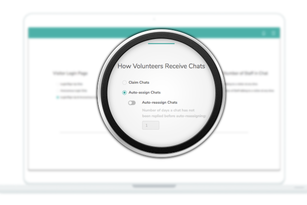
However, many organisations felt that there might be spam from allowing anonymous chats and could not afford for that considering their limited resources available.

‍

Hence, we made sure to include both a sign up and an anonymous option to negotiate between both our stakeholders' needs in our visitors' user flow (on the left).

2. Convenient

From our survey results and qualitative interviews, convenience is a key requirement for visitors. The ability to chat on mobile is important as often visitors are in bed on their phones when they need support.


Hence, we chose to develop our platform as a progressive web application, with a mobile-first interface for visitors.

3. Comforting Experience

Through our conversations with those struggling with mental health, a comforting experience would be extremely key to making sure visitors feel safe on our platform and minimize drop-off rates.

‍

Hence, when visitors first come onto our platform, they are greeted with a calming and comforting floating bubbles animation.

Volunteers

1. Efficiency

Because resources are limited and there will always be more demand than supply, I designed our platform to allow volunteers to talk to multiple visitors at once.

‍

To ensure that volunteers don't get overwhelmed, a clear and simple user experience was pertinent. As you can see in the volunteers' user flow (on the left), volunteers have one goal, which is to clear all chats in the left sidebar. 

2. Afford for escalation

Qualitative interviews with potential volunteers highlighted the importance of being able to flag chats they can't handle to supervisors, informing our decision to incorporate this flagging feature into our platform.

‍

Volunteers can flag chats to supervisors should they feel like they are unable to handle any particular chat. Supervisor(s) will then take the necessary action.

‍

Volunteers can also check in real time whether any supervisors are currently online so as to streamline the flagging process, especially in urgent cases.

Supervisors

1. Timely Notification

Drawing from insights found from our qualitative interviews with potential supervisors, it was pertinent that supervisors were notified of urgent action required when they are not on the platform.

‍

Hence, an email notification feature was incorporated so that supervisors do not need to be on the platform 24/7. Instead, they will be notified by email when urgent attention is required such as flagged chats.

2. Manage Chat Activity

We learnt from our interviews with potential supervisors that they would need to be able to efficiently monitor chat activity and have control over problematic activities.

‍

Taking that into account, the supervisor side is designed to have a flexibility of actions.

‍

To ensure chats are replied in a timely manner, supervisors can re-assign volunteers or even join the chats themselves. Having visibility of who's online also helps in deciding re-assignment.

‍

For flagged chats, the supervisor can unflag them once they no longer require extra attention.

‍

To efficiently keep track of the monitoring of chats, a read/unread color change feedback is incorporated as well.

3. Manage Staff Easily

Supervisors also need to be able to manage staff. In this case, staff refers to volunteers and supervisors. Hence, the supervisor interface is designed to create new accounts, disable inactive staff accounts, edit roles such as promoting or demoting from volunteer to supervisor and vice versa.

CHAPTER FOUR

Update

Pilot Test

Interesting Insight

  • According to the statistics pulled from the pilot test, there were more desktop users (56%) than mobile (44%), which differed from what we uncovered during the earlier research which informed the decision to go with a mobile-first design for the visitors' interface.

‍

  • The feedback from the forms highlighted that visitors likely saw themselves using our platform on their phones more due to its portability.

Snapshot

  • Deployed to 671 students from Raffles Hall, one of the university’s on-campus housing for 2 weeks, between 10 Nov 2019 to 24 Nov 2019 (peak exam period).

‍

  • Visitors were also prompted to fill out Google feedback forms after trying out the platform.
Because of the interconnectedness and complexity of Ora with various stakeholders, Ora was deployed for a pilot test with a small pool of students and HeaRHtfelt, the organisation that agreed to partner with us for the usability testing. Design changes were made after, backed by the results.
139
Registered New Visitors

5mins
Average Session Duration
1067
Chat Messages
242
Opened Browser Sessions
(15% returning visitors)

Usability Testing Feedback

Visitors

Little problems encountered aside from lack of response from volunteers when offline

100% would use Ora in the future (70% yes, 30% maybe)
On a scale of 1-5 (5=most likely), 100% would likely recommend Ora to friends (50% 4/5, 50% 5/5)

Volunteers

Anonymous messages were mostly genuine, different from the large amount of spams that  would have been expected


Concerns of being offline and getting a message → currently no notification if not on platform

Supervisors

User guides were helpful for staff onboarding


Question: What happens if a chat goes “unclaimed”?


Pilot partner was very satisfied and would use Ora in the future for their cause

Rapid Prototyping:
Key Design Changes

1. Going Offline

“It’s takes quite long for me to get a reply… and there is no feedback that I will be replied any time soon…”

“Maybe the chat can send a notification that the other person has replied to the chat so that i will know and can reply more promptly.”

- Feedback from Visitors
during the Pilot Test

“I won’t be online 24/7 so if I’m email notified when I get new messages that will be great so I know when I need to get back online and not have to be online all the time”

- Feedback from Volunteers
during the Pilot Test

2. Adding Admin
‍

“I see the value in claiming chats as volunteers can preview messages and best support visitors with the flexibility in replying chats they feel they can best handle.”

“On the other hand, with this claiming chat flow, some chats may be left unclaimed and the visitor will be left unreplied. These chats go unnoticed and won’t be flagged to supervisor. The burden then falls on the supervisors to actively monitor and claim these chats.”

- Feedback from Staff

“I am afraid that we will not be able to handle too many chats as our team is quite small. It might be because there are more spam because anonymous function is on.”

- Feedback from Staff

3. Dark to Light UI

“ The color scheme is a bit too gloomy, would prefer a brighter color.” (paraphrased)

- Feedback from selected visitors and partner organisation

Many changes were made during the rapid prototyping process. To not overwhelm you, I would like to highlight these 3 major design changes after usability testings, 2 of which are interaction changes and the last one is a UI change.

The feedback from both visitors and volunteers highlighted the need for an interaction shift from majority cases being online and real-time to offline. This accounts for smaller volunteer teams and continuity of chats.

‍

Change 1: When a volunteer replies, anonymous users will receive a browser prompt while visitors with an account will receive a email notification.

‍

‍

‍

Change 2: To ensure visitors aren’t left hanging when staff is offline, an auto-message will be shown to them

‍

Change made: When offline, volunteers will be notified via email when there are new messages; when online but on another browser, there will be a browser prompt that will notify them of chat activity. 

Feedback from HeaRHtfelt, usability testings and pitches with other organisations afforded for our discovery of various interaction flows organisations could take according to their needs.

‍

Ultimately, we want to partner with different organisations so that we can help as many people as we can.


Hence, to cater to more organisations and different needs, we added an admin level that allowed more interaction options and flexibility.

‍

Change: Addition of “Auto Assign”

Chats are auto-assigned to volunteers with auto-reassignment for chats not replied in a set time period to ensure timely replies.

‍

Change: Choice of Visitor Login Page

Organisations are able to turn off the anonymous feature if needed

‍

Before the pilot test, we tested the originally dark user interface (UI) with selected visitors and potential partner organisations.

‍

The original rationale for using the dark UI was because, during our preliminary research, we found that users are most likely to use Ora before sleeping. With this user behavior in mind, a dark mode design was chosen to aid a less straining and more comforting experience.

A Consensus

Both visitors and partner organisations were not such a fan of the dark UI.

‍

Hence, we shifted to a light UI which was launched during the pilot test and received great praise.

Before

After

Feedback from Pilot Test

"Pleasant and intuitive UI/UX”

- Visitor
"Very clean and comforting UI/UX"

- Visitor
"I like the colors, feels welcoming"

- Visitor
"Simple & Elegant”

- Volunteer
"Easy on the eyes and to use"

- Volunteer
"Pleasant and intuitive UI/UX”

- Visitor
"Very clean and comforting UI/UX"

- Visitor
"I like the colors, feels welcoming"

- Visitor
"Simple & Elegant”

- Volunteer
"Easy on the eyes and to use"

- Volunteer

CHAPTER FIVE

Outcomes

Testimonials

"It makes me feel assured knowing that I can openly share my problems and keep my identity a secret... especially when there is still a negative light on those suffering from anxiety or depression."
"I felt more comfortable knowing someone would be there listening."
"It was a good experience of having someone to talk to and the response was quite fast."
"It made me feel relieved and at ease. Feels good having somebody to talk to when I am lonely and sad."

Viv's Reflections & Ramblings

In a perfect world...

We had a really tight timeline of 2 months to produce a working demo-ready launch (inclusive of development). With more time, I would’ve refined the admin features and negotiate different stakeholder needs even more elegantly.

What I've learn...

Negotiating different stakeholder needs is definitely a challenge. Conceptualising such a complex product requires a lot of thought and cross-checks with stakeholders, and oftentimes things get overlooked. Usability testing really helped in identifying the gaps, which were rectified efficiently and effectively.

Final Favorites

Ending off with my favs, from our team win to publicity materials and illustrations!

Small Wins

Our team came in 1st-Runner Up for the STePs showcase which is an inaugural showcase held by National University of Singapore (NUS) School of Computing. During the pitch, many people really saw the need for such a platform, organizations and students alike. Our goal was to fill this mental health support gap and it was simply amazing to receive such validation for our solution.

‍

Here’s a picture of my team - Could not have done it without my wonderful team!


Publicity Materials


Illustrations

↑